What is it a data scientist yearn for most? For me it’s Data Visualization. We know that under those massive layers of junk there is always something important hidden that can get noticed with the visualization. More importantly we need analytics for establishing relationship among all the values which could be quite hassling if done manually given how large and unstructured the dataset we may have.
While working on spark, I stumbled upon the most basic and very well structured dataset found from “Kaggle” competition “Titanic”. Now the very first thing I wanted was to visualize this dataset in graphical form to understand better relationship among constraints.
One of the way to do that is via Zeppelin. Zeppelin provides a web based notebook that allow user to build reports for data analytic. In this blog I am going to explain about Zeppelin installation,configuration and graphical representation on Titanic data set.
Few important things to know about Zeppelin before we begin:-
1. It’s an open source tool
2. It does not require any other specific scripting language to learn. One can use Scala for data upload and manipulation (just like Spark) and SQL queries for graphical representation
3. It can be easily set up with the Spark Cluster.
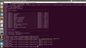
I have set up Zeppelin via incubator downloaded from Github repository. Since I have Spark 1.4.0 installed on my system. I executed command “sudo maven -X clean package -Pspark-1.4 -Dhadoop.version=2.2.0 -Phadoop-2.2 -DskipTests” (here -X enables exceptions,if there are any, to be displayed). Once the downloading process is completed it would look like this.
One can configure the set up if required to change the port number, assign some extra features like external cluster set up as master the setting can be done in zeppelin-env.sh. One can start Zeppelin by following command
incubator-zeppelin/bin$./zeppelin-daemon.sh start
1. In browser on localhost:8080 we get :-
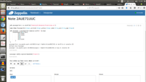
2. From “Notebook” tab we can create new notebook:- These Notebooks act like an interface in which one can type and execute text based commands.
2.1 In first step we have created a spark context which reads data from csv.
2.2 Then we have created a case class and mapped the CSV content.
2.3 And in last step we simply assigned it to data frames in temporary table called “titanic”
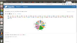
3. Now we can write a sql query to get dataset on the chart :-
The queries should be prefixed with %sql to invoke sql interpreter.
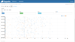
4. Right next to these chart options we can see “Settings” tab. These is used to maintain the variables for graphs, such as for following diagram which elements should present y-axis , which should present x-axis, their grouping attribute etc. could be selected.
This plotting of data allows one to get data insights and which helps in selection of predictive model would be best for the requirements of our data set.


Reblogged this on Play!ng with Scala.